Building an Interactive Drought Relief Map
Quick Links: Project Website | Source Code on Github
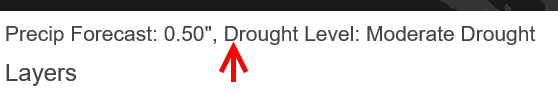
I recently published an interactive map that shows the current US Drought Monitor levels and the 5-day National Weather Service Quantified Precipitation Forecast (QPF). As stated on the site, "by overlaying these two datasets, you can analyze where drought conditions may improve or worsen over the next 5 days."
Background
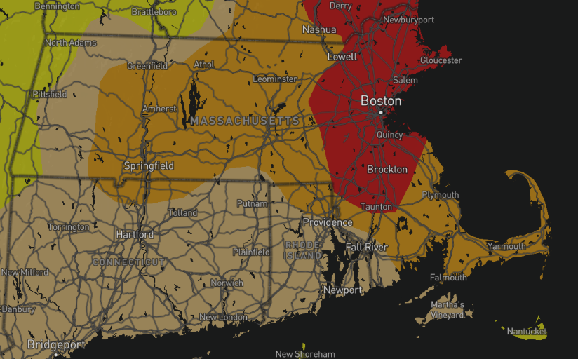
As of Sept. 8, 2016, all of Massachusetts was under some level of drought or dryness
There were two primary reasons that led to the creation of this site. The first is that I had been reading about the Mapbox GL JS framework and wanted some sort of project I could build using it. Secondly, living in eastern Massachusetts, I was well aware of the worsening drought that has gripped the state for effectively the past 2 years. While attending a Maptime Boston meetup back in July where there was a discussion about intersecting and overlaying different datasets, I came up with the idea to create this product.
Technical Details
The US National Weather Service provides a significant cache of its products in common geographic formats. They provide their QPF formats in both Shapefile/KML (vector) and GRIB2 (raster) formats, so it's relatively easy to use, no matter what your application. The Drought Monitor data, hosted by the National Drought Mitigation Center is also available in a variety of formats, including Shapefile.
Mapbox GL JS requires vector data in GeoJSON (as it's effectively the standard for transmitting geographic data over the internet today). I found a Node module shp2json which can easily convert shapefiles to GeoJSON. Since the Mapbox documentation states that URLs are preferable to passing the framework a GeoJSON-compatible object directly, I decided it would be best to serve the data as endpoints in an Express.js app.
I wanted the site to always display the latest data available, however since I was going to host it on Heroku, that presented a small challenge, since I couldn't just set a cronjob to go fetch the new data and save it somewhere. Instead, I decided to determine if new data should be available whenever a request was made for it. It was easy to determine this based on timestamps (defined in the dates.js module). Since it would take a short but noticeable amount of time to download and convert the data to GeoJSON, I also decided to cache the datasets in a Redis database. Redis does have support for complex and geographic datatypes, but for the purpose of this project, just storing the GeoJSON as one string seemed sufficient. Because I'm running on the free Heroku Redis tier, I was sure to purge any old data from the datastore when inserting new data.
Working with Streams
This project was a great opportunity for me to learn more about Streams in Node.js. As with the event-driven model Node uses (and perhaps because it's built on it?), streams can be a bit challenging to understand at first. But they are certainly very powerful when used correctly!
For example, perhaps the code snippet I'm most product of in this project fetches a drought monitor data .zip file and converts it to a GeoJSON stream (in this project's case, the HTTP response):
6 lines, excluding whitespace. No need to store and extract the zip file first. Neat stuff.
Certainly, I'm no master of streams (or Node in general), and one current inefficiency in my code is that I download and convert the data twice - once if there is a cache miss (the data is not in Redis), and then a second time to get the data as a string and store it into Redis. A good future enhancement would be to split the GeoJSON output stream to both return as the HTTP response and save into Redis simultaneously.
Mapbox GL JS Client
I appreciated the Mapbox GL API's design to separate layer sources and styling, and also how easy it was to implement custom styling. Both datasets I used have distinct color tables that are used almost universally wherever the data is displayed. Thus I wanted to stick to these color schemes on my site. It was super easy to make a color table array and use that to both style my map and populate my legend! I also appreciated it's responsive design; it made adding my query panel (see below) that works just as well on a smartphone as a desktop a simple addition.
Conclusion
This might be an overly-detailed explanation for a simple one-page map site. But it was an interesting project that exposed me to a number of new tools and ways of thinking and I think the results are quite cool! I showed it off to one of my meteorology friends who quickly started moving the layer sliders and understood the utility of overlaying drought and precipitation forecast data.