Weather Model Deep-Dive: Surface Pressure Artifacting
In my group at The Weather Company, speed is of the utmost importance. We serve traders in the energy markets, so getting our customers weather data faster enables them to in turn make decisions faster than their competitors on the trade floor.
One of our major products is plotting weather model data on maps from all the major global weather models. One of these is the Global Forecasting System (or GFS) model, run by the National Centers for Environmental Prediction (NCEP) within the United States government. NCEP offers GFS model data for download in a handful of different spatial resolutions. As a result of the speed requirements in our products, our site offers graphics produced with the lowest (that is, coarsest) resolution data since that data will be available and process significantly faster than the full resolution data. We also produce maps made with this full resolution data, though, so that clients can see the finer details of this weather model output.
This background sets the stage for a situation I was tasked to explain earlier today. Hurricane Matthew is currently churning in the middle of the Caribbean Sea and is expected to make impact as a major hurricane to Jamaica and Cuba in a few days. I was asked about a situation where our graphics seemed to be showing two different centers to the Hurricane as it approached southeastern Cuba depending on the resolution used:
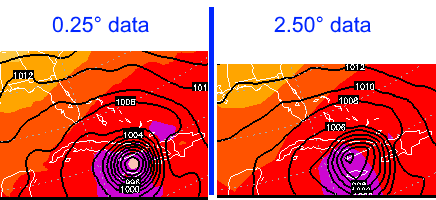
These graphics shade 1000-500mb Thickness values and contour Mean Sea Level Pressure (specifically at Forecast Hour 84 of Friday's 1200z run). You can see the lowest pressure of Hurricane Matthew is much more centered among the concentric isobars surrounding and is located just northwest of the eastern shore of Jamaica in the high resolution data, while the lowest pressure is much more "off center" and almost the entire length of Jamaica (about 200km) to the west in the low-resolution data.
My first thought when analyzing why there might be a difference in the plots was that we were plotting Mean Sea Level Pressure. MSLP is a derived field that corrects for terrain when measuring atmospheric pressure. Air pressure decreases as height increases (due to gravity), so the surface pressure at the top of a 6000 foot mountain will be significantly lower than the surface pressure along the ocean shore. By reducing surface pressure to MSLP, meteorologists can compare pressure readings anywhere on earth.
As it turns out, the reduction of surface pressure to MSLP was significant in the difference between the graphics, but indirectly, as the source grid (raw surface pressure) had significant differences between resolutions to begin with.
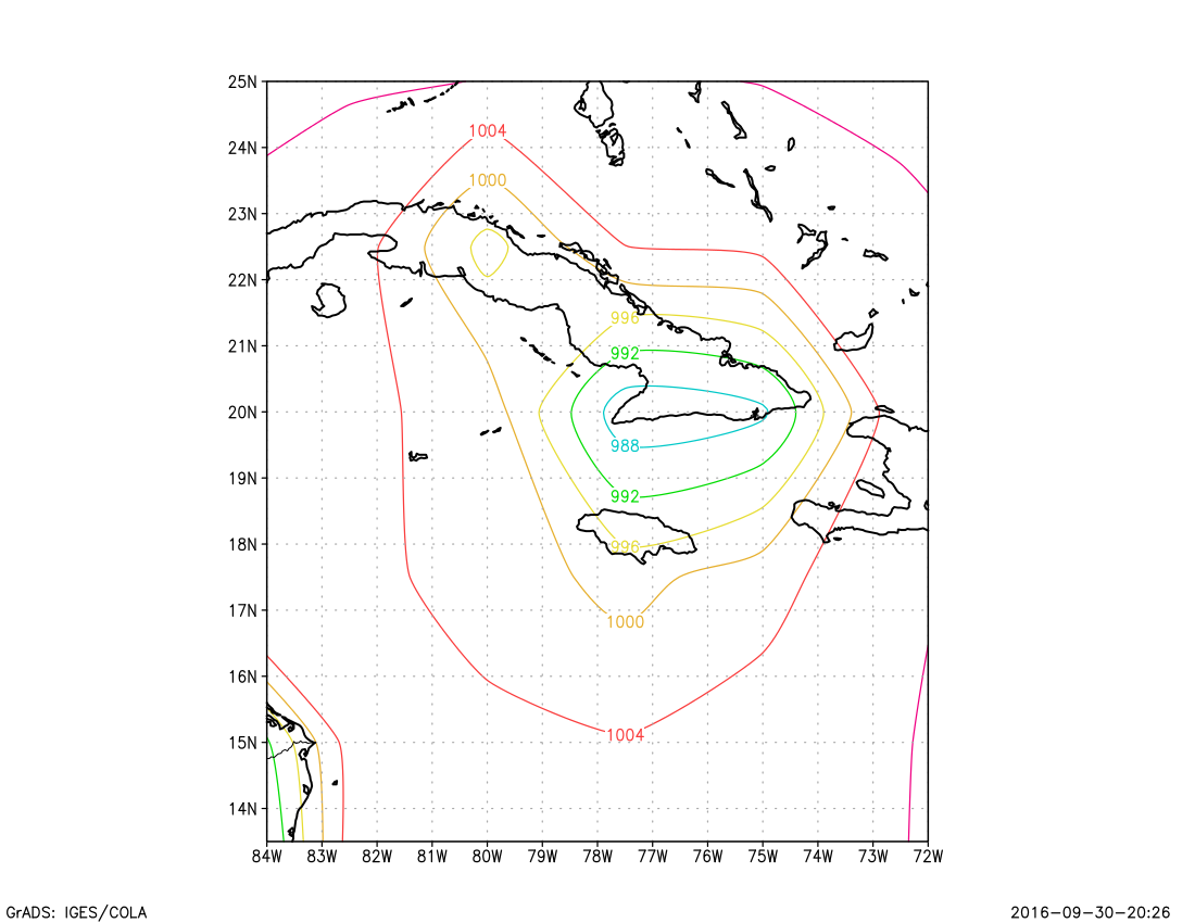
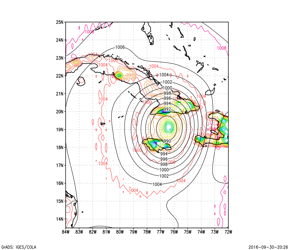
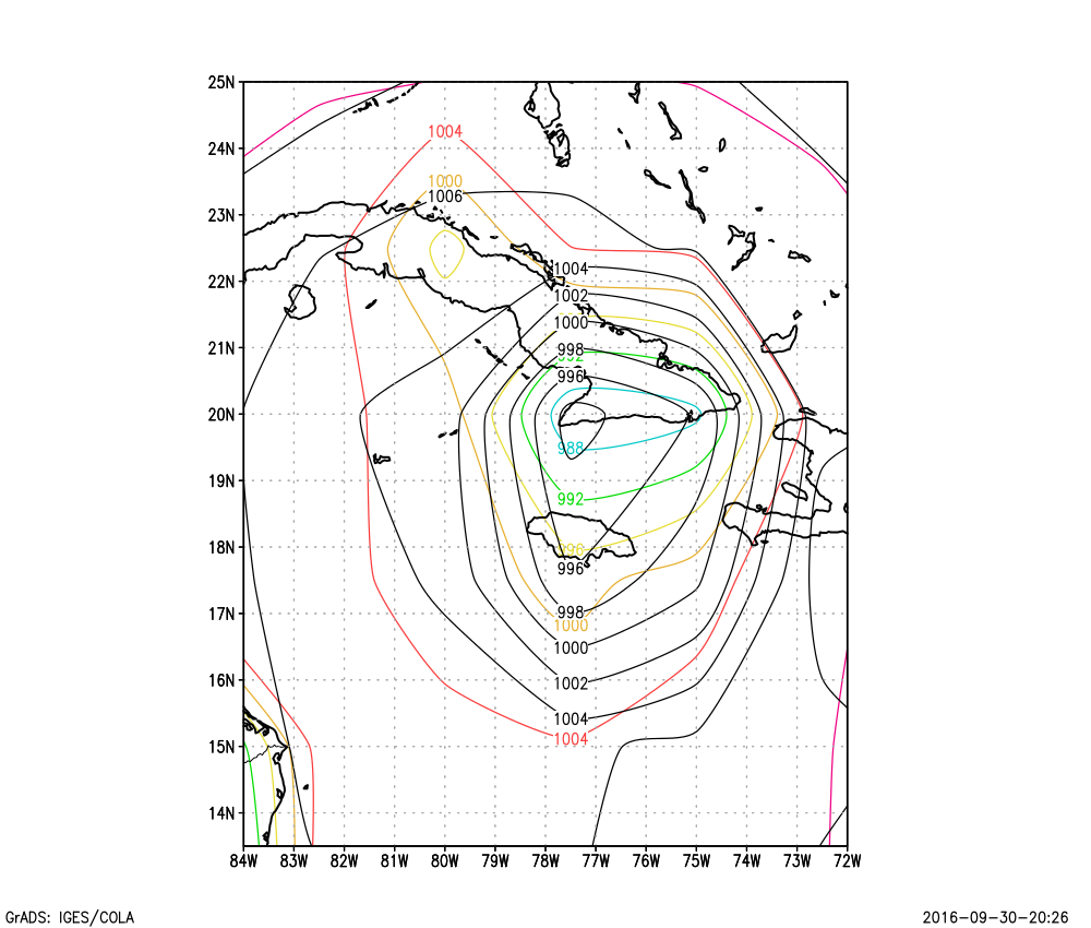
Below are the surface pressure fields (in hPa) from the 0.25° GRIB data (first image) and the 2.5° GRIB file (second image)
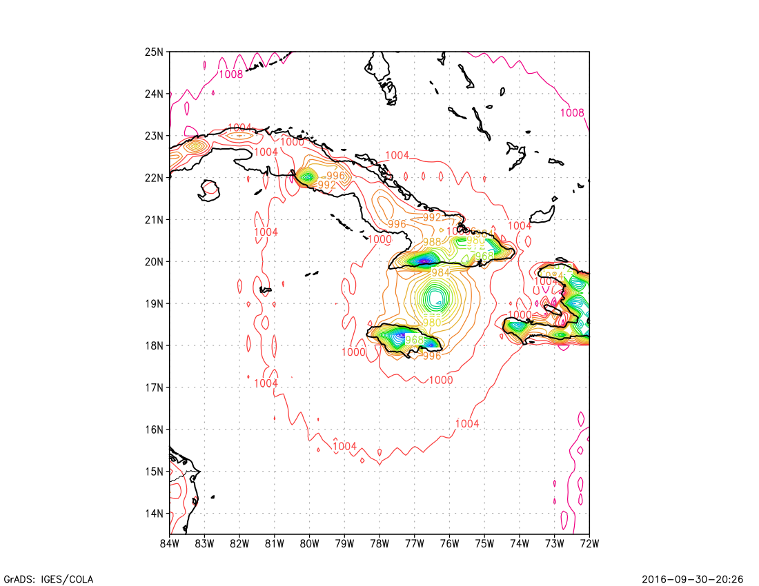
Many more contours (isobars) are present on the 0.25° image. On that image, you can see concentric circles of surface pressure isobars located over the water between Jamaica and Cuba that represents the center of Hurricane Matthew. However you also see even lower pressure in a tight gradient right along the southern coast of Cuba, and also towards the center of Jamaica. Why is that? Those "low pressure" minimums are due to topography.
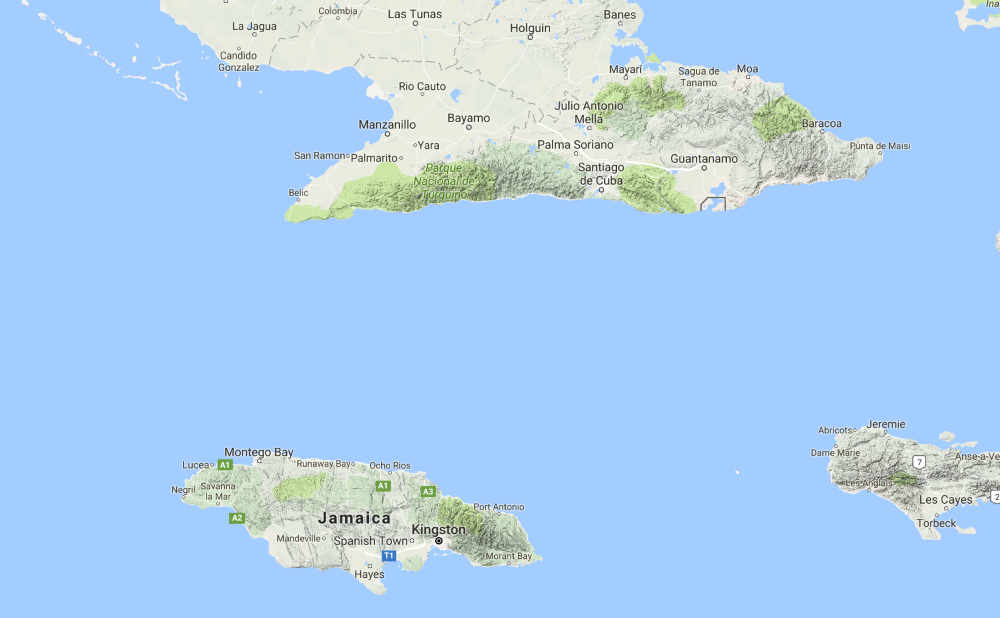
As seen in this Google Maps topographic map, there are steep mountains right along the coast, the same spots where the lowest surface pressures were modeled. (Many of the peaks along that mountain ridge are 4000+ feet in elevation, or >1200 meters.) At a high resolution, where grid points are only 0.25° longitude (~28km) across, there's plenty of grid points to represent both this change in elevation and the tropical system offshore. On a 2.5 degree grid (where each grid point is ~275km wide and 275km tall), there are many fewer grid points that cover the same geographic area. As we see here, because of how tall the terrain is in southern Cuba, it actually has a dominating effect on the surface pressure field, so you end up with a stretched minimum isobar that essentially encircles the mountain range, while the tropical cyclone is essentially reduced to nothing.
As expected, when you then apply the reduction to mean sea level pressure, the high resolution MSLP data (first image below) neatly accounts for the terrain and forms concentric isobars only around Matthew. Meanwhile, while there is some correction to account for elevation when the low-resolution MSLP field is calculated, it is still significantly stretched and the lowest mean sea level pressure value is found around the single center of lowest surface pressure, which is not aligned with the center of Hurricane Matthew at all.
(In these plots, colored contours are again surface pressure, while the black contours are MSLP, both in hPa)
Hopefully this article may help you to understand the difference between surface pressure and Mean Sea Level Pressure, and some of the pitfalls that may arise when viewing or visualizing model data. It was an interesting and deeply analytical problem that had me snugly wearing my "meteorologist hat" this afternoon.